Mind | Body | Spirit: iOS App Design
TL;DR
For some folks, the pandemic shifted how they approached their health. Through directed storytelling interviews, information architecture diagramming and usability research, I designed an app to help folks set achievable health goals, connect with community and stay accountable with their new routine.
Role: Researcher, UX/UI Designer
Methods: Directed Storytelling Interviews, Low-Fidelity Wireframes, User Flow, Clickable Prototype, Moderated Remote Usability Testing, Think-Aloud Protocol
The Problem
The COVID-19 pandemic changed everything, including how people think of their overall health. While there is a continued desire to focus on one’s health, getting started can be a daunting experience, especially when done alone.
How might we support & motivate busy adults to get back into a wellness routine that connects all aspects of health?
The Solution
Mind | Body | Spirit is a holistic wellness app designed to motivate and support busy adults who are looking to get back into a wellness routine by providing 1:1 coaching and recommendations for daily activities that can fit in their busy schedule.
The Process
DISCOVERY | Research and Synthesis
I started by conducting secondary research to become more familiar with the digital wellness space. In addition to downloading and using competitive services to comprehend their functionality, I analyzed their customer reviews and created a features list to define “table-stakes” for the app.
““I’ve fallen off the wellness wagon. This past year, I haven’t had the motivation to put myself first. And I feel bad about it and think about it a lot.” ”
After completing the competitive analysis, I conducted primary research using directed storytelling interviews to better understand current perceptions, motivations, expectations and needs in the mobile wellness space. My goal was to identify opportunities to create a more meaningful wellness experience for users. Three participants were interviewed and the same set of questions were used for each participant and were slightly adjusted to accommodate each participant’s narrative.
Next, I synthesized the research findings to uncover key user insights and redefined the goal statement to “How might we support & motivate busy adults to get back into a wellness routine that connects all aspects of health?”
DESIGN
As I started to narrow down some of the key features of the app, low-fidelity wireframes were created to identify what the new experience might look like and what might be most important.
Hand-sketched wireframes were digitized and annotated to call out key interactions and clarify what functionality could be tested in future research.
Additionally, user flows were created to outline a full end-to-end decision map for both onboarding and exploring the application. The overall journey was structured to prioritize two of the key insights from secondary research: Holistic health goals and 1:1 coach support to motivate and hold users accountable.
PROTOTYPE AND TESTING
UI Flows and hand sketched wireframes evolved into an interactive prototype that was used to validate the user journey through usability testing. Based on Steve Krug’s think-aloud interview protocol, I created a interview script and test plan document defining the goals, learning objectives and key tasks for the user to complete:
GOALS:
Gain insights around potential pain points and opportunity areas as it relates to key task flows (onboarding, connecting with a Coach, adding activities).
Evaluate the degree to which the app reflects a sense of 1:1 support, motivation, and accountability for user’s wellness goals.
TASKS:
Onboarding: Sign up for an account and set up goals
1:1 Coaching: Select a coach and schedule first check-in
Daily Activities: Add a new self-care task to their daily activities
The prototype was tested with four users by giving them scenarios to (1.) Set up an account, (2.) Connect with a coach, and (3.) Add a task to their daily activities. They were asked to talk out loud throughout the process, specifically paying attention to any confusion, any surprises and anything they enjoyed. Onboarding had a 100% completion rate, while connecting with a coach and adding daily activity came in at 75%.
The Findings and Results
Overall, users could articulate the value proposition of the app and thought that it could help them stay accountable to their goals by breaking bigger things down into smaller, bite-sized tasks. Based on feedback, there is more work to be done to define the role of the coach and when users select a coach in the overall user journey.


The Next Steps
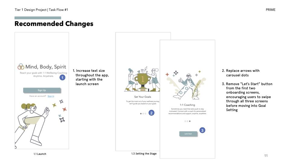
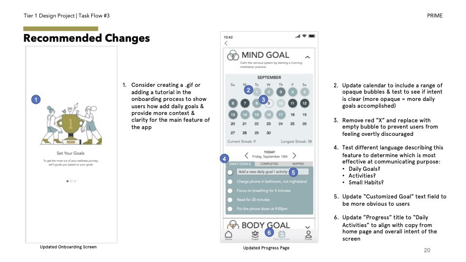
Usability testing revealed several recommendations to consider in order to improve functionality and understanding of key features. Tablestakes improvements include ensuring all content is ADA and WCAG compliant and updating the coach selection page with (1.) copy that better articulates user expectations of the user/coach relationship and (2.) adding micro interactions to communicate clearly to users the system’s state. Additional changes are detailed below.


